“As the sun colors flowers, so does art color life.” ~John Lubbock
Color enhances everything. It helps you tell a story without having to use words. Custom metal signs sometimes need pops of color to send the right message for the intended audience. However, according to Corky Binggeli and Patricia Greichen, authors of the book Interior Graphic Standards, “Color choices for sign messages, backgrounds, and graphics should be chosen to ensure adequate contrast and legibility.” They further state that signage guidelines dictate “a 70 percent contrast ratio of message to background.” Therefore, while colors for custom metal signs should complement the space they’re in, they should also use contrasting colors. This article presents some guidelines for choosing the right colors for your metal sign.
Contrasting Colors
The color wheel acts shows the relationship between colors. Contrasting colors are found in different segments of the color wheel. Yellow, for instance, is in the warm portion of the color wheel while purple is in the cool portion.
Jacci Howard Bear in an article entitled Contrasting Colors published on thoughtco.com states that “Colors don’t have to be direct opposites or have a set amount of separation to be considered contrasting or complementary. In design, it’s more about perception and feeling.” Therefore, you don’t need to stick to the rule of contrasting colors being on the opposite ends of the color wheel. You can work with colors that you think go well together, but using the color wheel as a guide can be very helpful.
Light Reflectancy
Paul Arthur and Romedi Passini crafted an ingenious method for determining the right colors to use in signs. They documented it in their book Wayfinding: People, Signs and Architecture. They created a table of light reflectancy readings in percentages. These readings are used to calculate the brightness differential.
A brightness differential of 70 percent or more guarantees greater legibility. Color combinations with a brightness differential less than 70 percent shouldn’t be used. The light reflectancy table is shown below.
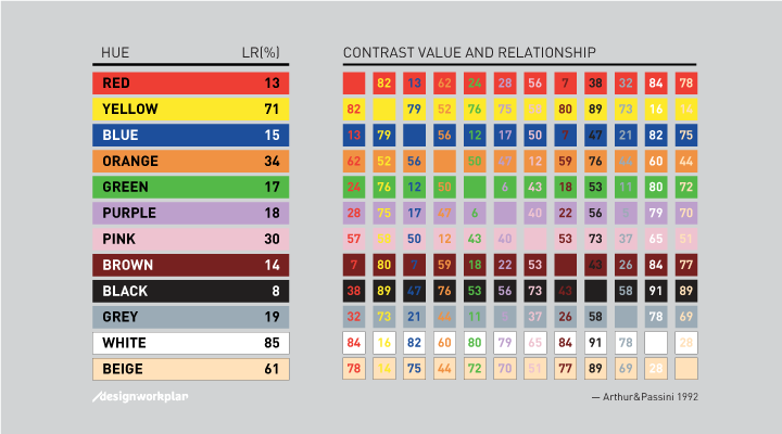
(Image Source: designworkplan.com)
Let’s use white and purple as an example.
Therefore, this color combination can be used. In this case, a dark purple would have to be used against the white background so that the words stand out.
Choosing the right color combination for your sign can seem like a daunting task. A consistent brand will use the company’s colors in all areas of branding, including signs. The trick is to ensure that you have the right color combinations for your brand from the get-go. The team of sign experts at ShieldCo can create an impactful metal sign in any color combination you choose. Call or email us today to schedule a free consultation.
Need a sign? Click the Free Quote button below!