The 3 things that can make your sign stand out over your competition
These days, there’s so much competing for the attention of your customers.
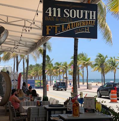
Ft. Lauderdale, FL
Each store is trying everything to attract customers to their brick and mortar. Creative window displays, flashy sale signs, later hours, fancy architecture for corporate spaces… So on busy streets how are you standing out to attract customers to your brand?
Even if you get them right out in front of your store, there’s still plenty of distraction from their phones. So what’s a business to do?
Let’s think about one of the first things someone looks at when they see your brick and mortar location – your sign. What are the 3 things that can make you stand out on your street and attract your customers attention:
Size
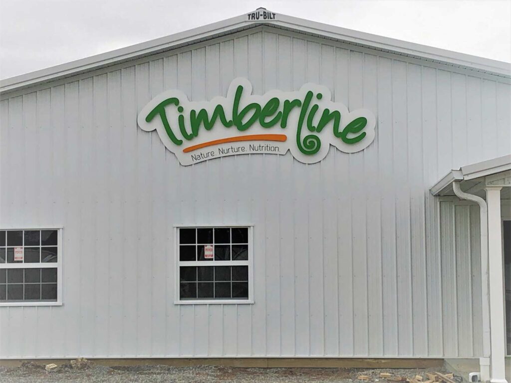
Marion, IL
In this case bigger is usually better. Step outside and look at your facility from a customer’s point of view- do they need to see you from across the street and down the road a bit? Do they see the front of your building or are they usually coming up from the side where a standout sign would be more appropriate? Consider how people access your building while you’re deciding on the size and placement of your sign.
If you go through all the work of having a brick and mortar and only put up a tiny door sign then you haven’t done yourself justice. You’re letting countless potential customers go by without even noticing you’re there.

Color

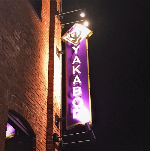
Indianapolis, IN
Once you have the right scale for your sign, the next step is color. High contrast colors always go a long way. Whether your logo/design is very simplistic or full of details, the color combinations are going to play a big factor in catching the eye of your customer.
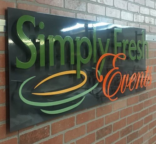
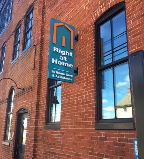
Aside from the design itself, you also want to factor in the surroundings. Will your sign be on a red brick building? A design with lots of matching red tones isn’t going to stand out. Are you surrounded by lots of trees? Maybe green shouldn’t be a dominant color to ensure it doesn’t blend in. Take a moment to again put yourself in your client’s shoes, are the colors going to draw their eye based on what’s around?
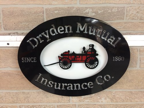
This doesn’t always mean lots of bright colors. A black and silver sign can stand out just as much as a bold blue and yellow combo. Just make sure your sign matches your brand and stands out against the building and immediate surroundings. Your sign works for you 24/7, let it be clearly seen!
Layers

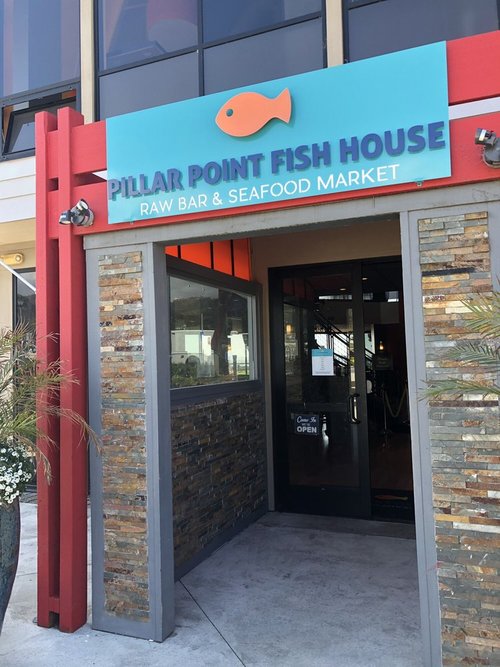
Oahu, HI
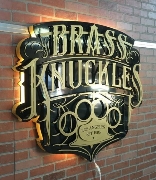
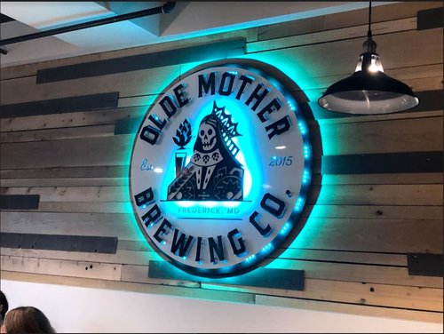
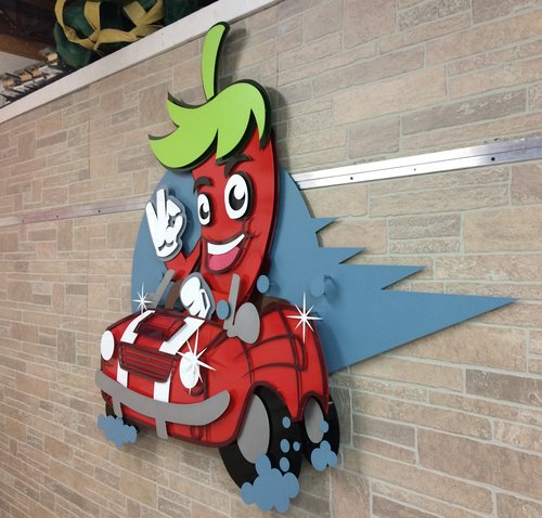
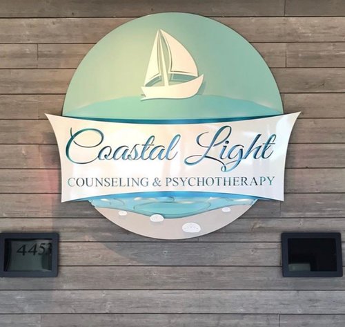
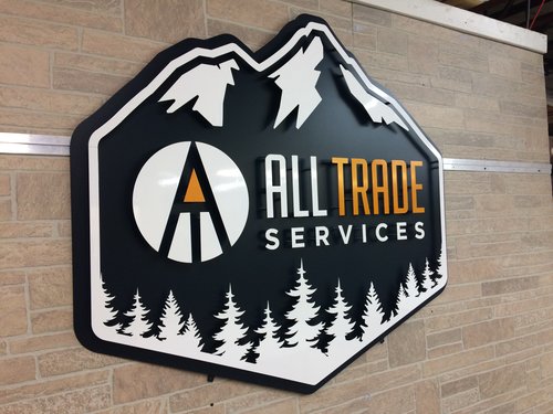
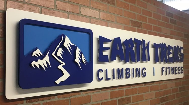
One of our favorite elements here at ShieldCo, is to create a sign that commands a double take by making it 3D. This is the artistic part of sign making that sets us apart from other standard sign companies. We exist to turn your logo into a work of art and help you standout among the crowd!
You can have the first two steps of size and eye catching colors nailed, but if you get the third ingredient of building depth through layers then you create a piece that’s truly captivating to your audience. It’s the difference in a passing glance and a longer pause that leads to walking inside as a potential customer.
The flat sticker type signs will get your name on the door but dimensional signs are what give you the wow factor on your street.
