Crafting Impressions: Tips and Tricks for Choosing Fonts in Metal Signage
What are the Best Fonts for Custom Signs?
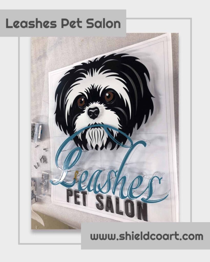
ShieldCo doesn’t just provide your home or business with a beautiful sign; it provides a work of art for your space. ShieldCo works with you to craft a custom metal sign you’ll love, but you might be wondering what the best font styles are.
There is no straightforward answer to that because the question of which sign font styles are the best comes down to where your sign will go and what type of purpose it will have. Sans serif fonts are popular for business signs but not necessarily for decorative signs. While script fonts can be harder for readability at a distance, they can be eye-catching for personal signs in the home or office.
Choosing a great font isn’t hard, regardless of where you’re displaying your signage. Our designers at ShieldCo will help every step of the way.
Sign Fonts for Readability
In a nutshell, the perfect font styles for your sign differ depending on where the sign will go and what you want it to convey and say. Font psychology dictates that different sizes, styles, colors, and sign usage affect emotions, thoughts, and behaviors.
Certain sign fonts matter if you’re looking to make a bold statement. Sans serif font categories are a great choice for large-scale text that will catch your eye. Elegant and lowercase letters may work for more subtle signs, like in your office or home.
| Font Style | Benefits | Drawbacks |
| Serif Font | Classic and traditional appearance | May be perceived as formal or dated |
| Easy to read with more text | Less modern or edgy for certain brands | |
| Sans Serif font | Clean, modern, and contemporary look | May lack a sense of formality for some |
| Enhanced readability, especially at a distance | Less decorative compared to other styles | |
| Script Sign Font | Adds a touch of elegance and personalization | Readability can be challenging, especially in small sizes |
| Ideal for conveying a sense of creativity | Not suitable for all-caps signage | |
| Display Fonts | Highly distinctive and attention-grabbing | May lack readability at smaller sizes |
| Stencil Sign Font | Industrial and bold aesthetic | Limited versatility for diverse brands |
| Provides a strong, rugged appearance | May not be suitable for formal contexts | |
| Custom Sign Font | Offers a unique and branded appearance | The time associated with the development |
| Tailored to specific brand requirements | Potential challenges in widespread use |
Best Font Size for Large Displays
Creating a custom metal sign with a great message requires some thought about font sizes. ShieldCo offers a lot of design options with colors, backgrounds, and even lighting options.
Naturally, where your sign goes dictates the font size. Large signs will require larger letters and larger fonts. Smaller sign fonts are more beneficial for indoor spaces.
For example, if you’re looking to choose lettering for a monument sign or to create a sign advertising your business, you’ll want a sign design that can be seen from a distance. Sans serif font sizes are ideal as they can be easily viewed at a distance.
Examples of Sans Serif Fonts Include
- Helvetica
- Arial
- Verdana
- Calibri
Smaller Fonts
ShieldCo’s custom metal signs aren’t only for your storefront, but we make gorgeous works of art that you’ll be proud to display in your office, your mancave, or even your living room.
Clients love their ShieldCo signs, reflecting their brand and company. Walking into a professional setting and being greeted by a ShieldCo sign will elevate the whole area.
The best fonts for closer viewing include simple serif fonts such as Times New Roman or Georgia. Wide open fonts like Tahoma also work as well. Futura, a geometrically shaped typeface, has small print and lowercase letters that can still easily be read.
Brand Guidelines and Consistency
Brand guidelines and a consistent message align with your company. Creating logos is something the design team at ShieldCo can help you out with if you don’t already have one. You may be wondering what this has to do with font style.
The largest recognizable brands typically don’t change their signage often. Keeping your design consistent with your brand helps people distinguish it from your competitors and maintains a professional appearance.
The best fonts are ones that keep design choices in line with brand guidelines and company identity. A suitable design needs to reflect the company. For example, a law office wouldn’t use Comic Sans, and a sports bar probably wouldn’t use a cursive script.
Material and Readable Signage
Once you’ve got your logo ready and your signage style set, you’ll want to think about which type of material and lettering you’ll want on your sign. ShieldCo offers plenty of different ways to meet your signage needs.
Aluminum, steel, and corten are three popular choices and work for both small and large signs. Lighting options are also available, and our powder-coating finish adds bright and vibrant colors that last way longer than paint. Our precision lasers cut metal within 1/1000th of an inch, allowing for incredible readability and intricate sign font styles in various sizes.
Gothic, Letterform, or Sans Serif Font?
Making sure you convey the right message is important when it comes to designing the best sign. We’ll make sure that the sign you want not only has a great font but is a beautiful piece of art you’ll want to display proudly.