Metal Masterpieces: Upgrade Your Space with Custom Indoor Signage
Metal Interior Signs with a High-End Look
There are tons of reasons someone would want to invest in custom interior signage. Personalized signs add a little flair to your home or man cave, while custom branding signs can give your business an elevated customer experience.
Metal signs can elevate any space, whether it’s a private one like in your home or a public one such as lobby signs or business signs. ShieldCo’s range of custom interior signs will bring any space to life with custom indoor signage that are works of art in their own right.
ShieldCo offers a full range of options for customizing interior signs, which includes our special aluminum metal signs and powder-coated materials so your favorite color shines.
See for yourself why hundreds of people have chosen ShieldCo for their custom interior sign needs
Reasons for Investing in Custom Interior Signage
Reasons
- Adds personalized flair to your professional or personal space
- Signage elevates the customer experience for a business or brand
- Decorate your home or office in a unique and affordable way
How Can Interior Metal Signage Benefit Your Business?
A well-made interior sign can benefit your business by helping customers navigate your space efficiently, and studies show that bright, easy-to-read signs reinforce overall customer experience and satisfaction. Even purchase signs near checkout counters have psychological effects on buying habits.
ShieldCo’s interior signs are more than just logo signs. They are pieces of art customized for you and represent your business and your brand’s reputation. Individual branding has individual needs, so ShieldCo works only with high-quality materials to come up with a perfect solution for your interior signage needs.
For businesses operating on a tighter budget, like bars or restaurants, well-lit interior signs can also be a cost-effective way of marketing as people are more likely to share and post creative signs on social media. People will often take notice when a business has a unique and decorative interior space.
Why Custom Indoor Signs Work
There are plenty of benefits to indoor signs and custom indoor signage that you probably haven’t even thought of. Benefits like:
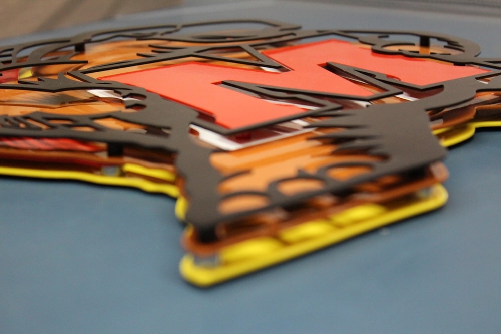
- Durability: Metal interior signs from ShieldCo are made from high-quality metals like aluminum, steel, and coreten. They are also laser-cut 1/1000th of an inch, which allows for designs offering incredible detail.
- Low Maintenance: Indoor signs are a smart investment with low maintenance. ShieldCo’s interior signs only need a wall for hanging and, if chosen, an outlet for optional lighting. Regular cleaning and polish will ensure long-lasting aesthetics.
- Memorable Impressions: Custom signage, whether for your company, building, or personal office, should create a lasting impression. Use engaging graphics, wordplay, and different colors to enhance brand memorability. Aim for people to associate your professional services even when away from your business.
ShieldCo’s Indoor Signs FAQ
What types of custom metal signs does ShieldCo offer?
Single Layer
This option cuts out all lettering to expose the wall behind the sign. It’s a simple design but still impactful.
Single Layer With Back Panel
Similar to a single layer, this adds a panel behind the sign to provide added contrast. It adds depth and visual interest to the sign, making it look 3D.
Multi-Layer
This sign style features your logo and/or lettering precisely cut out and layered off of the back panel to give depth and texture.
Individual Layering
An option for when your wall color or texture contributes to the overall aesthetic of your signage. This type of sign separates each part of your logo to be hung as an individual piece.
Multi-layer and Individual Layer
Individual lettering mounted to your wall plus our signature layered logo adds an artistic element that stands out.
How hard is it to install a custom metal sign?
Every sign that ShieldCo ships comes with a custom set of instructions for installing signage. Mounting options vary depending on the signs and where they will go. Typically, installation and wall mounting will be done with either a:
- French Cleat: Ideal for easy mounting and multi-point strength
- Drywall Anchors and Stems: Ideal for individual pieces and letters
What materials are used for ShieldCo’s custom interior signs?
ShieldCo offers a range of material options, including steel, coreten, and aluminum. Our custom metal signs and powder-coated materials. These ensure a durable and visually appealing finish.
Can I use my custom logo or font style for my indoor sign?
ShieldCo works with your business logo to create a design you’ll love. If your business already has a logo, we’ll create a metal sign you will love. If you don’t have any business signs or logo, our team of designers will help create one based on pictures or sketches you provide.
What is the turnaround time for ShieldCo Signs?
Turnaround time is as fast as 10 business days from payment. All of ShieldCo’s signs are 100% custom designed and made in-house, so creating your sign takes time to craft. After requesting a quote, we’ll get back to you within a few business days for your personalized sign. Once we know what you’re looking for, the design process starts.