Office Decor Themes That Are Anything but Boring
Gone are the days when office spaces meant beige walls, fluorescent lighting, and uninspiring furniture. Today’s businesses understand that creative, thoughtfully designed workspaces can significantly impact employee productivity, satisfaction, and overall well-being. Research shows that a well-designed office can boost happiness and increase productivity by 20%.
Whether you’re refreshing your current workspace with updated lobby signs or starting your new design from scratch, these eight office decor themes will transform your environment from bland to brilliant, developing a space where employees actually want to spend their time.
Industrial Chic with a Polished Edge
Industrial design imbues modern workspaces with an edgy, authentic feel. Think exposed beams, raw textures, and custom signage that command attention while maintaining professional sophistication.
Materials such as steel, concrete, and reclaimed wood strike the perfect balance between rugged and refined. The beauty of industrial chic lies in its versatility: you can include weathered metals alongside polished surfaces, or blend rough concrete with smooth glass elements.
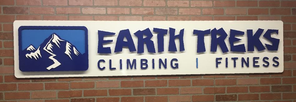
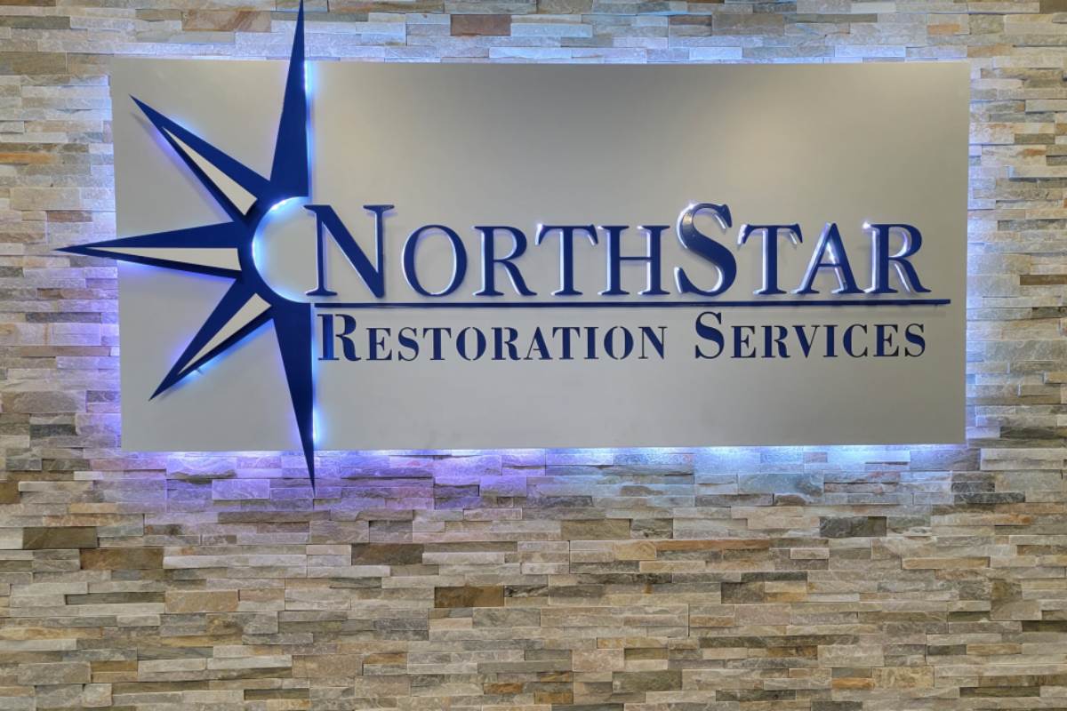
This theme works particularly well for creative agencies, architecture firms, and modern coworking spaces that value innovation and authenticity. Custom metal office lobby signs, available in brushed steel or powder-coated finishes, can serve as stunning focal points that reinforce your brand identity upon entry.
The crux of this style is restraint. Too much industrial styling can feel cold and unwelcoming, so balance harder materials with softer textures. Consider incorporating leather seating or fabric panels to achieve this balance.
Bold Branding Zones
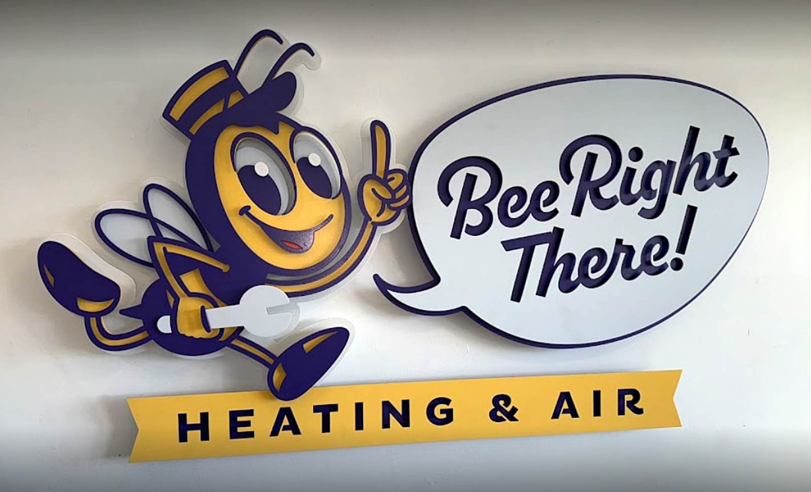
Transform blank walls into powerful brand statements with dedicated “brand walls” featuring layered dimensional logos, value statements, or color-blocked art installations.
Integrate your brand colors, fonts, and iconography across wayfinding and feature signage to design a cohesive visual experience. This approach seamlessly integrates your market strategy into your decor while constructing highly photogenic, Instagram-worthy spaces.
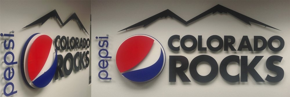
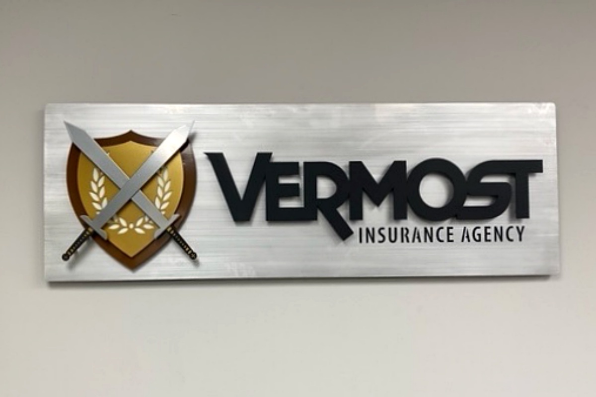
Consider three-dimensional metal logos that extend from the wall, building depth and visual interest. Multi-layered designs can incorporate your company colors through powder coating, ensuring durability while making a lasting impression on clients and employees alike.
Bold branding zones that feature custom signs work exceptionally well in reception areas, conference rooms, and high-traffic corridors and create memorable focal points that reinforce company culture and values.
Modern Minimalism with Purpose
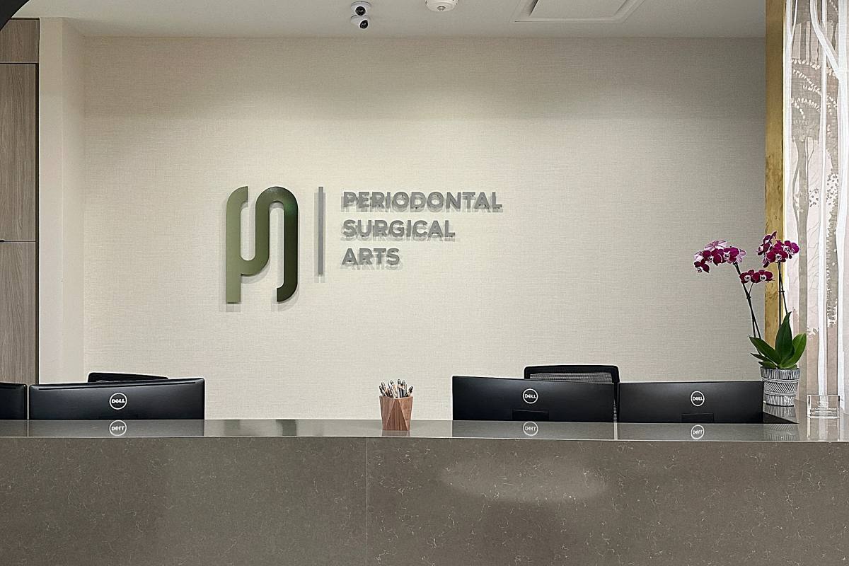
Clean lines, neutral tones, and uncluttered layouts define modern minimalism, but the magic happens when you accentuate these elements with sleek brushed metal signs and carefully chosen statement pieces.
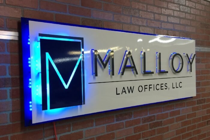
Use signage sparingly but impactfully, with high-contrast or backlit designs that draw the eye without overwhelming the space. Matte black or brushed aluminum finishes complement the minimalist aesthetic while providing necessary wayfinding and branding elements.
This approach is effective in finance, tech, and wellness industries where clarity and focus are paramount. The absence of visual clutter helps employees concentrate, while thoughtfully placed elements, such as dimensional logos or metal directory signs, add sophistication.
Minimalism doesn’t have to be boring; it can emphasize intentionality. Every element should serve a purpose, whether functional or aesthetic.
Nature-Driven & Biophilic Design
Bringing the outdoors inside is scientifically proven to benefit employee well-being. Nature exposure enhances employee well-being, and studies indicate that biophilic design can improve productivity by 6% and creativity by up to 15%.
Incorporate greenery, maximize natural light, and use wood-accented decor to develop calming, restorative environments. Pair these organic elements with warm-toned metal signs in copper, bronze, or earth-tone powder coatings that complement natural materials.
The presence of natural elements in the workplace, such as plants and natural light, has been shown to enhance employee well-being, reduce stress, and promote mental health. This makes biophilic design an investment in both aesthetics and employee satisfaction.
Living walls, natural wood furniture, and metal signage with organic shapes or nature-inspired finishes build harmony between built and natural environments.
Vintage Meets Modern Mash-Up
Combine mid-century furniture, retro color palettes, and distressed metal signage for offices with character and personality. This eclectic approach celebrates both heritage and progress.
Add one-of-a-kind elements, including repurposed materials or curated art pieces, to generate conversation starters throughout your space. Vintage-inspired metal signs with intentionally aged finishes can tie together old and new elements.
The secret to successful vintage-modern fusion is balance. Use contemporary technology and furniture as your foundation, then layer in carefully selected vintage pieces that tell your company’s story or reflect your industry’s heritage.
This theme works particularly well for boutique firms, creative studios, or hospitality offices where personality and storytelling are important brand differentiators.
Artistic & Eclectic Vibes
For businesses that center around creativity and innovation, artistic and eclectic office spaces encourage personal expression and out-of-the-box thinking.
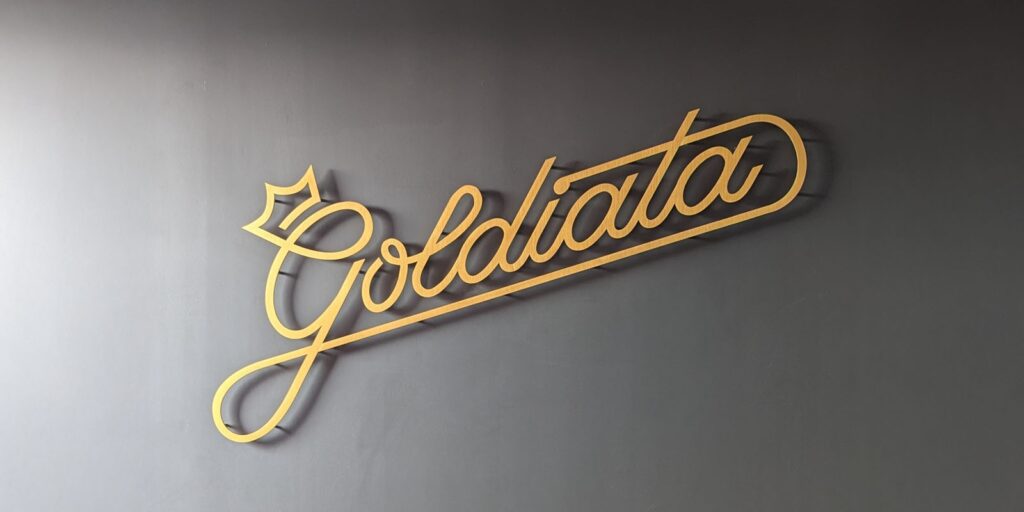
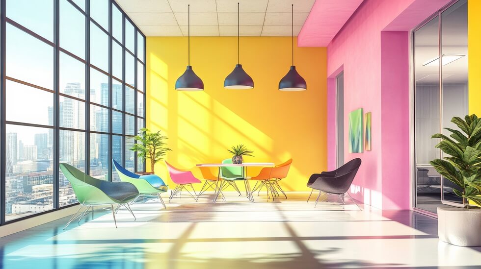
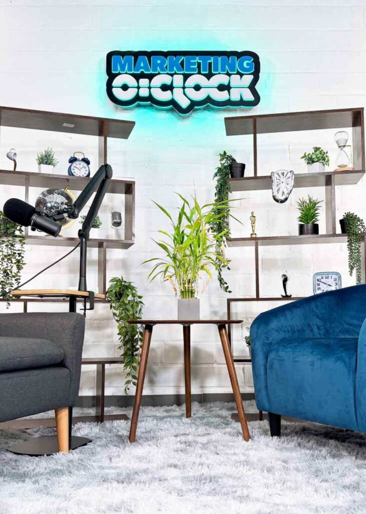
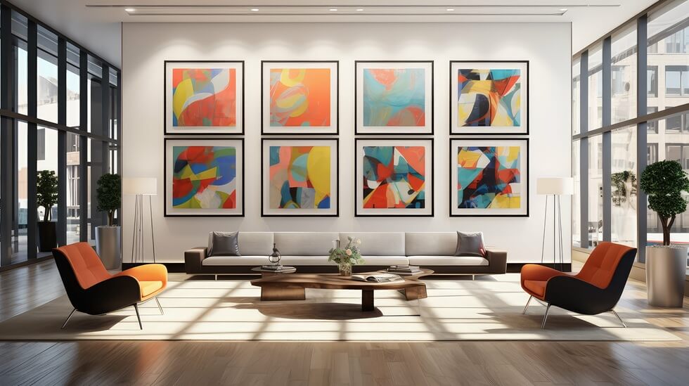
Incorporate murals, abstract art, custom sculptural signage, and bold color schemes that energize and inspire. Lobby signs can become art pieces themselves through innovative shapes, mixed materials, or interactive elements that make powerful first impressions on visitors.
Encourage creativity by allowing team members to contribute to workspace personalization within cohesive design guidelines. This might mean rotating art displays, customizable workstation elements, or collaborative mural projects.
This approach fits perfectly with design agencies, fashion brands, marketing firms, or any studio environment where artistic energy drives business success.
Soft Luxury for Elevated Comfort
Soft luxury whispers quality without feeling cold or unwelcoming. Think muted tones, upholstered textures, minimalist decor, and matte-finish metal signs that exude sophistication.
This design philosophy prioritizes comfort and elegance through the use of high-quality materials, subtle textures, and refined color palettes. Metal signage in matte black, champagne, or soft gray finishes maintains the understated luxury aesthetic.
Ideal for high-end professional services, such as law firms, real estate agencies, and consulting practices, soft luxury generates environments where clients feel valued and employees take pride in their work.
Attention to detail makes all the difference. From the weight of door handles to the finish quality of your office lobby signs, every touchpoint should reinforce your commitment to excellence.
Themed Spaces with Personality
For companies with strong cultural identities, themed office spaces can effectively reflect their brand personality while creating memorable environments that attract and retain top talent.
Whether your theme draws from travel, pop culture, gaming, or sci-fi, turn your concept into a cohesive space through custom signage, coordinated wall graphics, and themed decor elements.
Metal signage can play a central role in themed spaces, whether through space-age finishes for tech companies, industrial weathering for manufacturing brands, or playful shapes and colors for creative agencies.
This approach is most effective for startups and forward-thinking brands that value company culture and individuality as competitive advantages. The goal is to execute your theme professionally while maintaining workplace functionality.
Transform Your Office with ShieldCo Art
Are you ready to move beyond boring office decor and design a workspace that inspires, engages, and performs? The right combination of thoughtful design and custom signage can transform any office environment from forgettable to remarkable.
At ShieldCo Art, we specialize in creating custom metal signage that brings your office decor vision to life. Our three-dimensional, artistic approach to office lobby signs and branded environments helps businesses nationwide to make a powerful first impression while reinforcing their distinctive identity.
From industrial chic to soft luxury, our collaborative design process makes sure that your signage perfectly complements your chosen theme while standing up to daily use. With in-house fabrication, powder coating finishes, and nationwide shipping, we make it simple to upgrade your workspace no matter where you’re located.
Contact ShieldCo Art online or call (240) 394-9893 to discuss how custom metal signage can elevate your office design and build the inspiring workspace your team deserves.
